

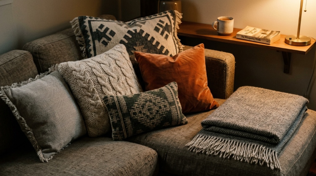
24 Sep How to Build a Cohesive Color Palette With Throw Pillows and Blankets
Most rooms don’t fail because the furniture is wrong. They fail because the textiles fight each other. A navy sofa, a rust blanket, and a bright teal pillow can each look great on their own and still create visual chaos together. The fix isn’t buying all new furniture — it’s understanding how color, texture, and proportion work in the accent layer. Whether you’re starting from scratch or working with a specific product like the guide to MIULEE decorative velvet cushions, the same principles apply. This article walks through a practical system for choosing pillows and blankets that look intentional rather than accidental.
Quick Answer
Build a cohesive palette by choosing one dominant color already present in your room, adding one secondary color from the same temperature family, and introducing a small accent in a contrasting tone. Repeat each color at least twice across pillows and blankets, vary texture to add depth, and keep the ratio roughly 60% dominant, 30% secondary, and 10% accent. The goal is repetition with variation, not matching.
Key Takeaways
- Pull your palette from existing fixed elements like walls, rugs, or artwork rather than starting from a blank slate.
- Stay within one color temperature (warm or cool) for your dominant and secondary colors; use the accent to create contrast.
- Texture differences — velvet, linen, chunky knit, cotton — do more for visual interest than adding more colors.
- Odd numbers of pillows generally read as more balanced, but scale and fill matter more than count.
- Test your combination in the room’s actual lighting before committing, since warm and cool bulbs shift how colors appear.
Start With What’s Already in the Room
The fastest route to a cohesive palette is to stop shopping and start observing. Look at the largest permanent elements in your space: wall color, flooring, sofa or bed upholstery, and any large rug or piece of art. These set the boundaries you’re working within, and they’re expensive to change.
Identify two or three colors that already repeat across those surfaces. A beige wall plus a walnut floor plus a cream sofa gives you a neutral base. A rug with hints of olive and rust gives you two accent directions to pull from. These become your anchors.
Why starting from the room beats starting from a store display
Store displays are lit with carefully controlled lighting, styled by professionals, and photographed in ways that flatter the products. A pillow that looks like the perfect complement to a display sofa may clash badly with your actual sofa’s undertone. Working from your room’s real colors removes that guesswork.
What if your room is almost entirely neutral?
A neutral room is an advantage, not a limitation. You have maximum freedom to introduce color through textiles. Choose one saturated color as your dominant accent and one softer supporting tone. For example, in a gray-and-white bedroom, a deep emerald and a muted sage create depth without competing with the base palette.
Apply the 60-30-10 Rule to Textiles
The 60-30-10 rule is a standard interior design guideline: 60% of a space’s visual weight in a dominant color, 30% in a secondary color, and 10% in an accent. For pillows and blankets specifically, this translates into how much surface area each color covers.
If you have three pillows and one throw blanket on a sofa or bed, the 60% color should appear on the largest items or the most repeated items. The 30% color fills in the middle layer. The 10% accent is often a single small pillow or a thin stripe or trim detail.
A practical example
Suppose your sofa is charcoal gray. Your 60% is the gray already on the sofa, so your textiles don’t need to repeat it heavily. Your 30% could be two cream or off-white pillows. Your 10% could be one mustard or burnt orange pillow. A chunky knit blanket in a muted oatmeal picks up the cream and adds texture without introducing a fourth color.
When the rule breaks down
If your furniture is already multicolored or patterned, the 60-30-10 split becomes harder to apply cleanly. In that case, reduce the number of colors in your textiles. Pull one color from the pattern and repeat it across two or three pillows in different textures, then leave the rest neutral.
Choose Colors Within the Same Temperature
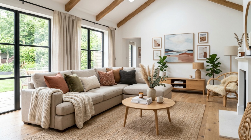
Color temperature — whether a color reads warm (red, orange, yellow undertones) or cool (blue, green, purple undertones) — is the most common source of palette failure. A warm cream and a cool white placed next to each other can look like a mistake rather than a choice, even though both are technically “white.”
Decide whether your room leans warm or cool, then keep your dominant and secondary colors on the same side. Use the accent color to cross the line intentionally if you want energy, but do it once and deliberately.
How to tell if a color is warm or cool
Hold the fabric against a pure white sheet of paper in natural daylight. Warm colors will look slightly yellow, orange, or red next to the white. Cool colors will look slightly blue, green, or gray. This test is more reliable than reading product descriptions, which often use vague terms like “greige” or “taupe.”
Mixing temperatures on purpose
A cool gray room with a single warm mustard pillow can look intentional and vibrant. The key is that the accent is clearly an accent — small, isolated, and repeated maybe once or twice. If warm and cool colors are split evenly, the room reads as unresolved.
Use Texture to Create Depth Without Adding Colors
Texture is the most underused tool in pillow and blanket styling. Two pillows in the same color but different textures — one smooth velvet and one nubby boucle — create more visual interest than two pillows in different colors but the same fabric.
This matters because adding colors has a limit. Most rooms look best with three to four colors in the textile layer. Texture lets you keep working within that limit while still creating variety.
Common texture combinations that work
- Velvet with linen or cotton for a soft-versus-crisp contrast
- Chunky knit with smooth satin or silk for weight contrast
- Boucle with leather or faux leather for a matte-versus-sheen contrast
- Corduroy or ribbed fabric with flat woven cotton for line-versus-solid contrast
Velvet specifically: what to know
Velvet reflects light differently depending on the direction of the nap (the pile direction), which means the same velvet pillow can look lighter or darker as you move around the room. This is usually an advantage — it adds subtle variation. But it also means velvet pillows can look shinier or more faded than expected depending on your light source. Velvet also shows crushing and pressure marks, so it’s better suited to pillows that get arranged rather than pillows that get leaned on heavily.
Balance Scale and Proportion
A common mistake is buying pillows all in the same size. A sofa or bed with four 18-inch pillows looks flat and monotonous, regardless of how well the colors work. Varying size creates hierarchy and visual movement.
A typical arrangement uses one large pillow (22 or 24 inches), two medium pillows (18 to 20 inches), and one or two smaller accent pillows (12 to 16 inches). On a bed, a lumbar pillow in front of standard pillows adds shape without overwhelming the arrangement.
Match pillow size to furniture width
A 24-inch pillow on a narrow accent chair will look oversized and unstable. A 12-inch pillow on a deep three-seat sofa will look lost. As a general guideline, the largest pillow should be roughly one-third the width of the seating surface it sits on.
Blankets: draping versus folding
A blanket draped loosely over the arm of a sofa reads as casual and inviting. A blanket folded into a neat rectangle and placed on the seat reads as more formal. The same blanket can shift the entire mood of the arrangement, so decide which effect you want before styling.
Test the Palette Before You Commit
Colors behave differently under different lighting conditions. A combination that looks balanced in a store’s bright, neutral lighting may look muddy under your room’s warm lamps or washed out under cool daylight.
Bring samples home. If you can’t bring the actual pillows or blankets, bring fabric swatches or even paint chips in similar tones. Place them in the room at different times of day. Look at them under the room’s actual lamps, not just sunlight, For more guidance on selecting comfortable bedroom essentials for the family, check out our guide on how to choose the best pillow for your child.
A quick decision checklist
- Do the colors appear in at least two places each across the arrangement?
- Is there one clear dominant color, or are all colors competing equally?
- Do the textures vary, or are all fabrics similar in sheen and weight?
- Do the pillow sizes vary, or are they all the same scale?
- Does the arrangement look intentional in both daylight and artificial light?
Common Mistakes That Break Cohesion
Certain errors appear repeatedly in rooms where the palette feels off. Recognizing them makes them easier to avoid.
- Buying pillows one at a time. Shopping piece by piece usually produces a collection of individual favorites rather than a coordinated set. Plan the full arrangement before purchasing.
- Matching too exactly. Pillows that perfectly match the sofa color disappear into it. A small shift in tone creates definition.
- Ignoring the undertone. Two colors that “should” work together often fail because their undertones conflict — a warm beige with a cool gray, for example.
- Overloading with patterns. One patterned pillow is usually enough. Multiple patterns in different scales can work, but they require more care than most rooms need.
- Forgetting the blanket. A throw blanket is not an afterthought. It’s often the largest textile surface in the arrangement and can either tie the palette together or undo it.
Adapting the Palette to Different Rooms
The same principles apply across rooms, but the emphasis shifts.
Living rooms
Living rooms usually have more textile surface area and more traffic, so durability matters alongside color. Choose fabrics that can be spot-cleaned and rotate pillow positions occasionally to prevent uneven wear.
Bedrooms
Bedrooms allow for softer, more layered palettes because the lighting is often warmer and the mood is calmer. A tonal palette — multiple shades of the same color — works especially well here and is easier to maintain than a high-contrast scheme.
Seasonal rotation
If you want to refresh a room without repainting or reupholstering, keep the dominant and secondary colors fixed and swap only the accent. Changing one or two accent pillows and the throw blanket can shift a room from summer to winter without disrupting the core palette.
Frequently Asked Questions
How many colors should a pillow and blanket palette have?
Three to four colors usually works best, including any neutrals already in the room. More than four tends to feel cluttered unless the room is very large or the colors are closely related tones of the same hue.
Can I mix patterns with solid pillows?
Yes. A common approach is one patterned pillow, one or two solids in colors pulled from the pattern, and one textured solid in a neutral. This keeps the pattern as a focal point rather than one of several competing elements.
Should pillows and blankets always match?
They should coordinate, not necessarily match. Sharing at least one color or one texture creates a visual link. A blanket in a completely unrelated color with no connection to the pillows will usually look disconnected.
Does the pillow color need to match the sofa?
No. In fact, pillows that contrast with the sofa color often look better because they stand out. The connection can come from the rug, artwork, or blanket instead. The goal is cohesion across the whole arrangement, not a direct match to one piece.
How do I fix a palette that already feels wrong?
Remove the item that feels most out of place and look at the arrangement again. Often a single incompatible pillow or blanket is causing the problem. If removing it doesn’t help, the issue is usually a temperature conflict between the dominant and secondary colors.
What’s the easiest way to start if I have no idea what colors to use?
Pick one color you already like that appears somewhere in the room — a rug, a piece of art, even a book cover. Build the palette outward from that single color using the 60-30-10 ratio. Starting from one anchor is simpler than trying to design a palette from nothing.
Conclusion
A cohesive palette is less about finding the perfect colors and more about repetition, temperature consistency, and texture variation. Start with what’s already in your room, choose one dominant color and one secondary color from the same temperature family, then add a small accent for contrast. Vary sizes and fabrics so the arrangement has depth. Test everything in your actual lighting before committing. If you get those basics right, the specific products matter far less than how they work together as a system.
Sorry, the comment form is closed at this time.